

ChitoTech
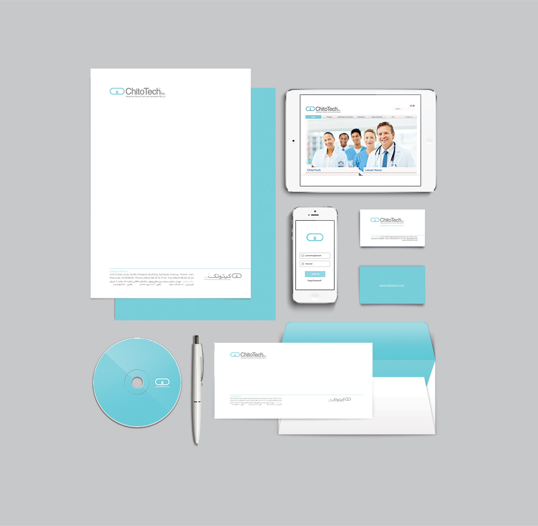
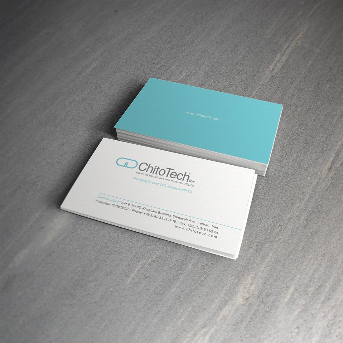
Chitotech is a healthcare company whose visual identity I redesigned. They wanted to keep the shape of their previous logo which reminded Capsule shape.
I redesigned their new logo to mimic the previous design they had which was based on the form of a capsule but I put my own twist on it.
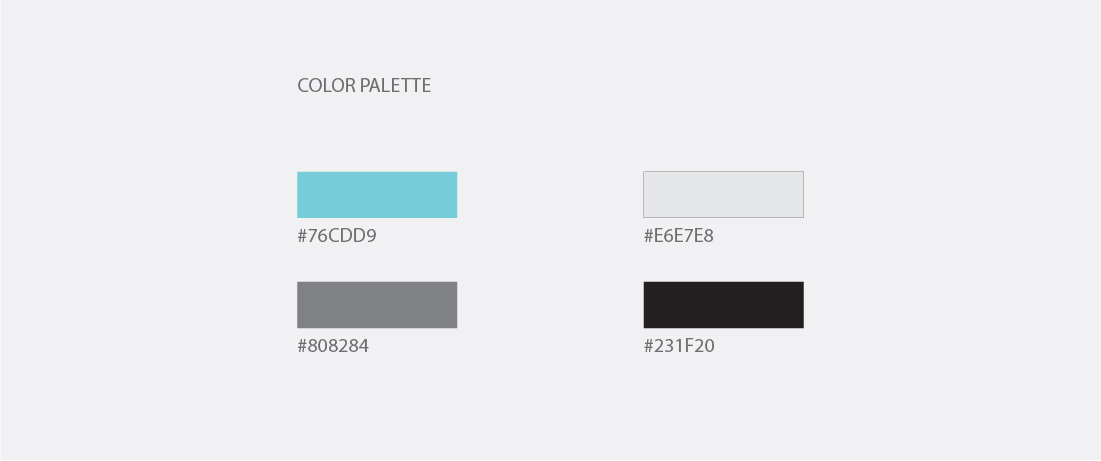
I chose bright colors in the new design and white spaces to reinforce their brand image which was meant to represent reliability and health.
RESPONSIBLE FOR
Re Branding, Web Design
Date
December 16, 2014
Category
Design